UBC Commute
Mapping how long it really takes 50,000 commuter students to reach UBC, and what a SkyTrain extension would change.
Most UBC students do not live at UBC. The campus sits at the western tip of a peninsula, and every weekday tens of thousands of students travel to it from across Metro Vancouver. For a group project in my final year of the geography degree, my teammates and I decided to map that commute: how long it actually takes to get to campus from different parts of the region, and how a proposed SkyTrain extension would change the answer.
The question sounds simple. It is not. Transit access to a single destination varies block by block, and averages hide the pattern. We wanted a map where you could find your own neighborhood and see your own commute, not a statistic about everyone's.
What we built
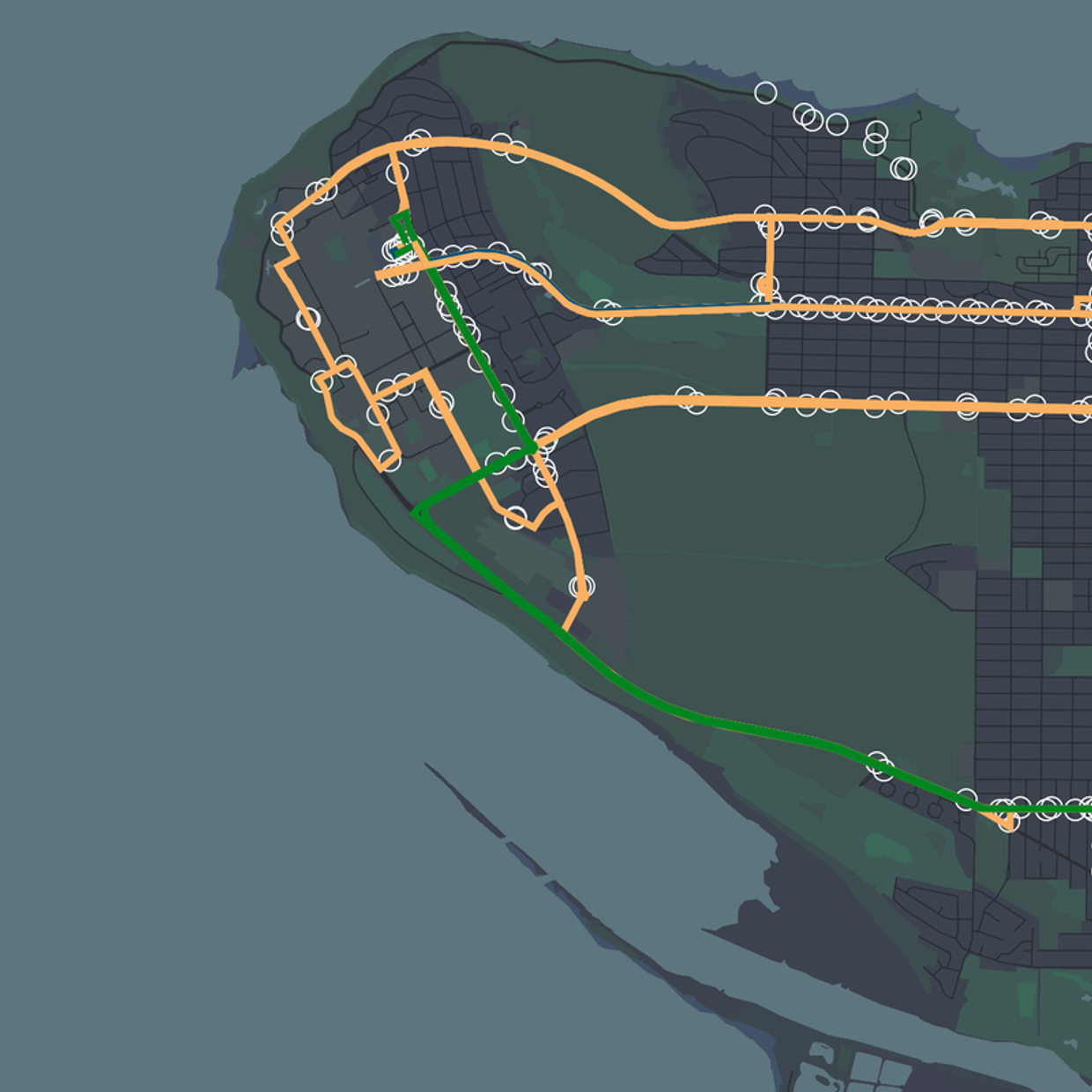
We built an interactive web application in Leaflet.js, with GeoJSON for the spatial data and plain HTML, CSS, and JavaScript around it, published on GitHub Pages. Three views did the work. Isochrone maps showed travel-time reach to and from campus, drawn as bands: everywhere you can reach within a given window. A bus frequency heatmap showed where service is actually dense, which is a different thing from where routes exist on a system map. And a visualization of the current transit network tied the two together. A toggleable layer compared today's coverage against the proposed SkyTrain extension, so you could flip between the present and the possible future for the same address.
The isochrones were the part that stretched me. Plotting points on a Leaflet map is easy. Generating travel-time polygons and rendering them cleanly, so the bands read as one coherent surface instead of a pile of overlapping shapes, was new territory. That work changed how I think about accessibility analysis. Access is not a dot on a map; it is a shape, and the shape is uneven.
The maps made the unevenness plain. Two neighborhoods at similar straight-line distances from campus could sit in very different travel-time bands, because frequency and connections matter more than distance. The extension layer showed which parts of the region a new line would actually pull closer to campus, in minutes rather than in press-release language.
It was a team project, and honestly one of the better lessons in that too: dividing map work so the pieces still feel like one product takes real coordination. But the thing I carried forward was the isochrone habit. On every accessibility question since, my first instinct is to ask what the travel-time surface looks like, not where the stations are.